ARTicles
Gwen John: Strange Beauties - Recreating her Colour Palette
Gwen John was a remarkable Welsh Artist, whose paintings have a strange beauty and, on the surface, may appear deceptively simple, but is in fact subtlety complex. This is the story of how Gwen John's colour palette was recreated.

Gwen John was a remarkable Welsh artist, whose work is possibly unfamiliar to most, and until recently, overshadowed by that of her brother, Agustus John. She was born (22 June 1876) and lived in Haverfordwest, before moving to live in Tenby, when she was eight, where she sketched and painted on the local beaches. From 1895 until 1898, she studied at the Slade School of Art in London, which at the time was the only art school that allowed female students. However, it was in Paris that she had her studio and created the work that we can now see today in the exhibition “Gwen John: Strange Beauties” to honour her legacy and showcase her significant contributions to the art world, in this 150th year since her birth.
To look at a painting by Gwen John is to enter a world of profound stillness and subtle chromatic complexity. As both professional paint makers and practicing artists, we at A J Ludlow, have always been fascinated by her ability to evoke deep emotion through a disciplined, tonalist palette. When the National Museum Cardiff (Amgueddfa Cymru) invited us to develop a bespoke range of exclusive merchandise inspired by the exhibition, we were thrilled at the opportunity to pay tribute to such an influential figure in the art world.
To tailor a collection of watercolour paint and painting gifts, that would mirror Gwen John’s work and reflect the exhibition’s themes, we needed to first define the colours Gwen John used in both her oil and watercolour paintings, To do this we produced a set of swatches with over 50 probable hues to match with the colours used in her paintings, and during our meeting with the curators at the Museum, they allowed us to see and physically compare Gwen John’s sketches and paintings with our prepared swatches and match the colours used in her paintings to ensure that each hue captured the essence of Gwen John's unique style. This not only allowed us to delve deeper into her artistic process but also helped us appreciate the nuances of her technique. So that, we would be able to create a range of bespoke painting materials to bridge the gap between her early 20th century studio and the modern colour palette.

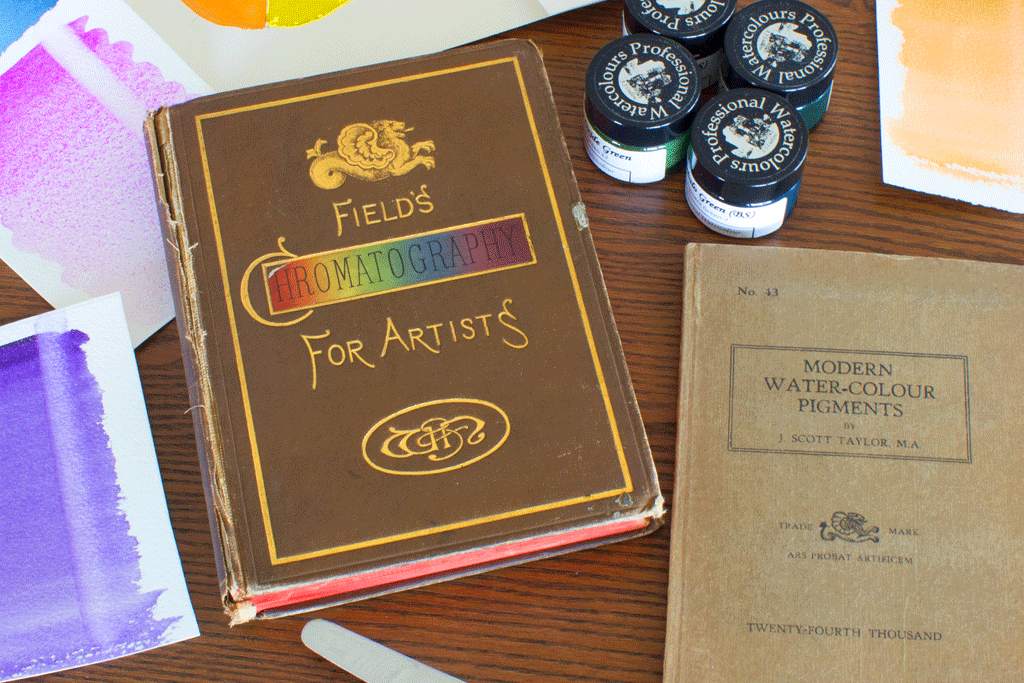
Figure 1: The Science of the Palette; selecting the colours for the Gwen John watercolour paint and painting sets.
Having behind-the-scenes access to Gwen John’s paintings in the National Museum’s collection allowed Andrew to compare his prepared swatches of A J Ludlow Professional Watercolours with the hues displayed. With his knowledge and experience of possible colour mixes, he began to create a possible palette for each of the paintings analysed. This allowed a selection of colours for each of the painting sets, which were refined as the designs were painted and the colour mixes defined.
From the original cat paintings viewed Sepia, Raw Sienna and Cadmium Scarlet swatches were selected, whilst for the foliage and flowers set, Yellow Ochre, Cadmium Scarlet and Paris (also known as Prussian) Blue gave the best selection to create matching hues in the two painting on which the set was designed; all these colours are mentioned in Gwen John’s own colour notes.

Figure 2: The many painted examples of the paint-your-own cards painting set designs.
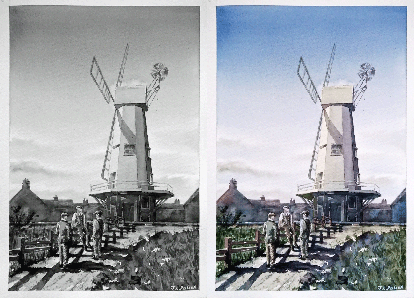
With respect to the painting set, featuring “the Japanese doll” design, the original is an oil painting on canvas, which was painted around 1927 in her Paris studio. Gwen John’s oil palette is known for its muted and subtle tones, no doubt resulting in the extensive use of white in her colour mixes. She did however, introduce a splash of bright colour into her paintings as in the blue and scarlet of the doll’s Kimono-style dress. To recreate this painting, five watercolours are used; Ultramarine Blue, Cadmium Scarlet, Burnt Sienna, Raw Sienna and Sepia. To achieve the subtle, muted tones of Gwen John’s original, the white of the paper is used as the base for thinly applied colour, in keeping with the traditional techniques of watercolour painting.

Figure 3: The many painted examples of the painting set designs, "Young girl in brown hat and coat" and "the Japanese doll".
The 15ml jar and “bijou” six watercolour mixing sets, were also developed from this meticulous work with the emphasis on matching Gwen John’s colour palette as close as modern pigments can allow. Included is a watercolour specially created for the “Strange Beauties” exhibition, “Gwen John’s Green”, which is replicated from colour notes she made on one of her paintings (NMW A 5513) in the National Museum’s collection (see figure 4).

Figure 4: An example of Gwen John's colour notes found on her painting, "Garden with flowers" (NMW A 5513)
A set of six pure pigments, inspired by the paintings of Gwen John, was also produced with some detective work. Unfortunately, very little has been published concerning the pigment’s Gwen John used on her palette, but work behind the scenes at the National Museum Cardiff is helping to shed light on some of the pigments she may have used.
On the reverse of many of the watercolour studies and sketches in the Museum’s collection are notes concerning the watercolours she used in her colour mixes. By knowing the watercolour ranges and brands available in Paris at the time Gwen John was working there, the Senior Paper Conservator was able to get a better understanding of the pigments she may have used. Furthermore, non-destructive analysis of oil paintings in the collection have also yielded an insight into the pigments favoured by Gwen John. From this information, Andrew selected six pigments to reflect Gwen John’s oil colour palette.
Lithopone – barium sulphate-zinc sulphide mixture / Colour Index Pigment White 5
Zinc white (pigment white 4) has been identified as one of the pigments Gwen John used in her oil paintings. However, it has subsequently been proven to be unsafe for long-term archival oil painting due to its tendency to make paint layers brittle and prone to cracking and delamination over time. A safer alternative is Lithopone, which was developed in the 1870s as a non-toxic substitute for basic lead carbonate.
Chrome Rutile Yellow – chromium titanium oxide / Colour Index Pigment Brown 24
Naples yellow has been referred to in colour notes on the reverse of some of Gwen John’s watercolour sketches. The genuine pigment is derived from lead antimonate (pigment yellow 41), but it is possible that her notes refer to an imitation, which was available from the 19th century. Chrome rutile yellow is a modern non-toxic substitute and the pigment included in this selection has a similar hue to genuine Naples yellow dark.
Cadmium Red (Yellow Shade) - cadmium sulphoselenide / Colour Index Pigment Red 108
This pigment is a bright and clean orange-shade red, which has an identical hue to genuine vermillion (C.I. pigment red 106). At the time Gwen John was working in Paris, colours based on red cadmium pigments were offered as imitation vermillion.
Iron Oxide Violet - iron (III) oxide / Colour Index Pigment Red 101
Indian red has been referred to in colour notes on the reverse of some of Gwen John’s watercolour sketches. The colour is named after the rich deep red soil found in India and this synthetic pigment captures the dark bluish red colour associated with this iconic artists’ colour.
Ultramarine Blue - sulphur containing sodium aluminosilicate / Colour Index Pigment Blue 29
Ultramarine blue (also known as Guimet or French ultramarine) was a popular, inexpensive blue in 20th century France. This pigment is lightfast and has an intense red shade blue hue, making it an ideal addition to Gwen John’s palette, as a warm primary blue.
Chrome Oxide Green - chromium (III) Oxide / Colour Index Pigment Green 17
Referred to in her notes as “vert Anglais”, this pigment is an opaque earthy yellowish-green with excellent light fastness. Not to be confused with the hydrated chrome oxide, viridian (pigment green 18), which Gwen John may have referred to as “lac vert” in her colour notes.

Figure 5: Investigating how the watercolour paintings were painted and which techniques Gwen John may have used.
As we developed this range, we did something that many modern artists rarely find the time to do: we painted Gwen John’s subjects again and again. There is a common misconception that repetition in art is a lack of imagination, but by revisiting the same cat or the same figure, we moved past the “what” of the painting and into the “how”. We felt the rhythm of her systematic approach - the way a slight shift in a cool grey could change the temperature of an entire painting. This process was more than just testing our pigments; it was a meditative journey. We realised that by narrowing our focus and returning to the same painting, we weren’t just recreating her art, we were learning her language. The watercolour sets are our invitation for you to join that conversation to slow down and to find the “strange beauty” in the subtle, repeated details of your own world.
As in all journeys, we learnt a considerable lot about Gwen John, whilst developing this range of watercolour products. Although she liked to use muted tones, she was very precise with the colours she painted. She often made notes about the colours she used on the back or the bottom of her paintings. Because she was so precise - literally cataloguing her colours like a chemist might-she is a bridge between the technical world of paint manufacturing and the spiritual world of fine art. Gwen John’s work is deceptively simple. To reproduce it, one can’t just throw paint on a canvas or piece of paper; it requires incredible restraint. Trying to replicate that precise balance between a “warm grey” and a “cool grey” is a master class in subtlety. We have also noticed her paintings are about space between things and the stillness which gives a unique style to her paintings.

Figure 6: The A J Ludlow professional quality Gwen John specially commissioned merchandise is only available to purchase from the museum gift shop at the National Museum Cardiff (Amgueddfa Cymru).

This specially commissioned merchandise to accompany the Gwen John: Strange Beauties exhibition is exclusively available to purchase from the museum gift shop at the National Museum Cardiff (Amgueddfa Cymru). Immerse yourself in the amazing world of Gwen John. Don’t miss this once-in-a-generation opportunity to see the exhibition, it’s on from 7th February to 28th June 2026, bringing together rarely seen work from the collections of the National Museum and others from around the world.